Appointee
Embeded app for healthcare appointments
The clinic appointment scheduling app is a modern, intuitive, and human-centered solution that simplifies the process of scheduling clinic appointments. It is designed to save users time and eliminate the frustration often associated with the traditional appointment scheduling process. It’s imagined to be embedded in the different healthcare systems and used as an individual component.
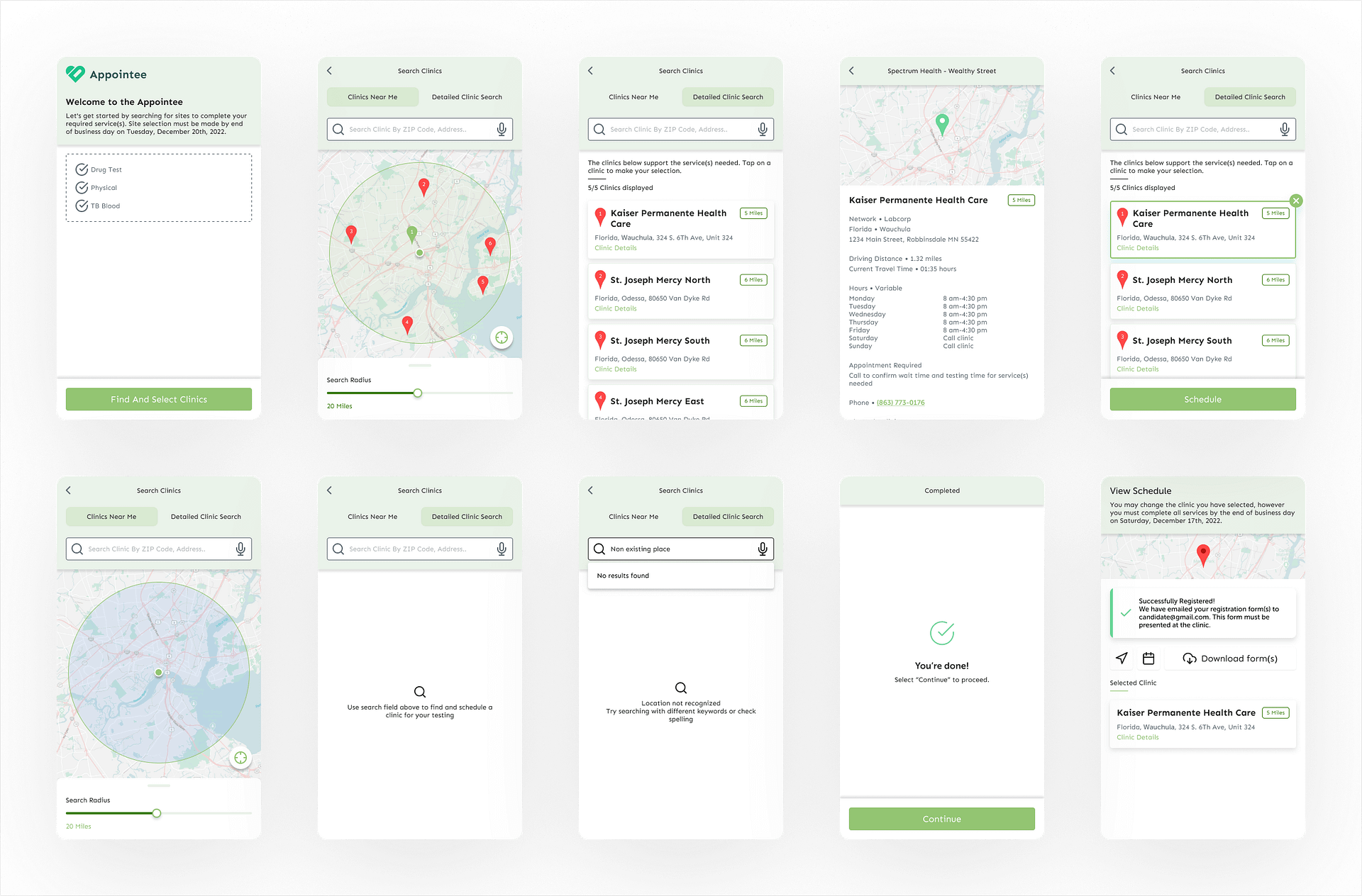
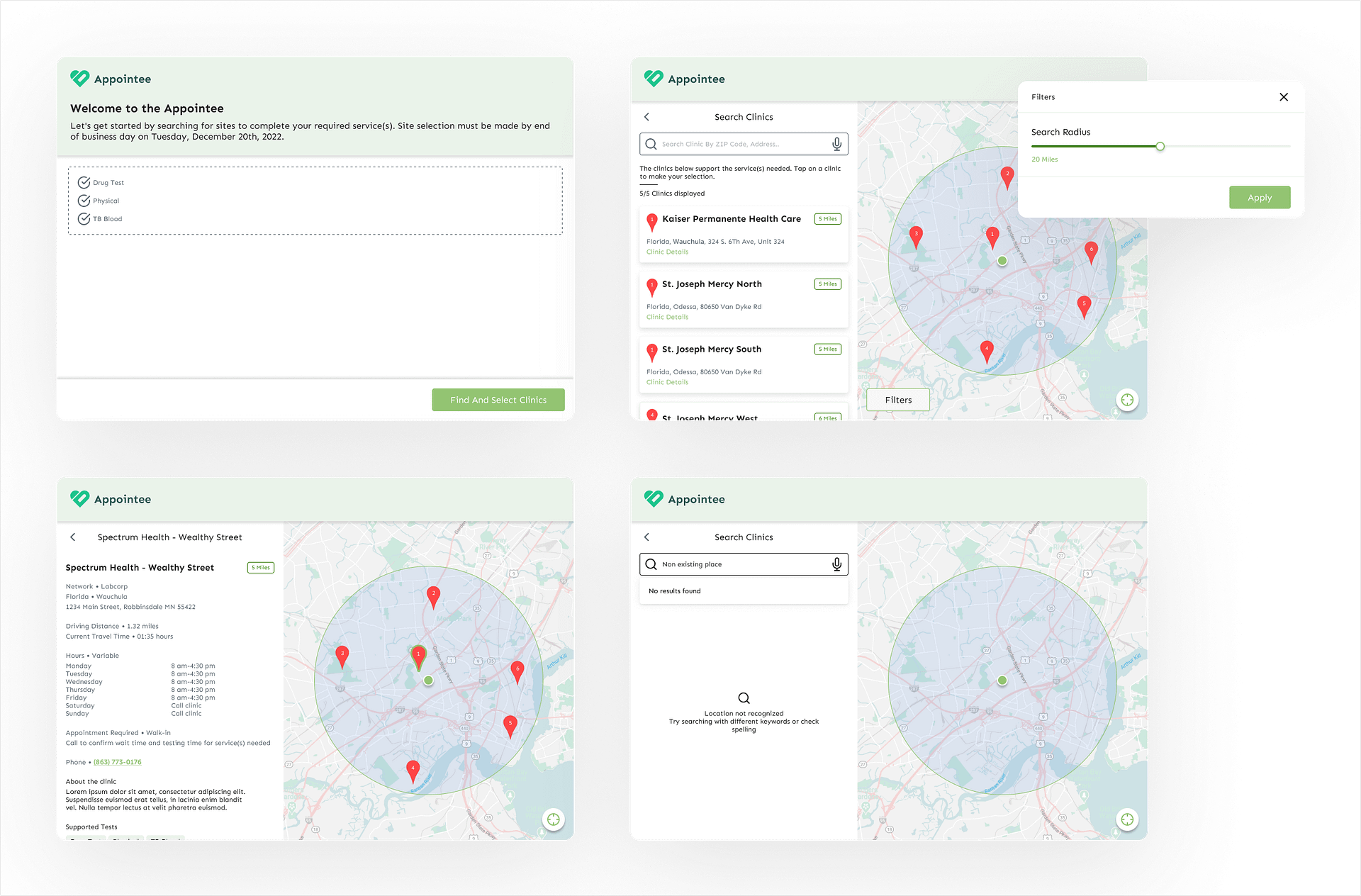
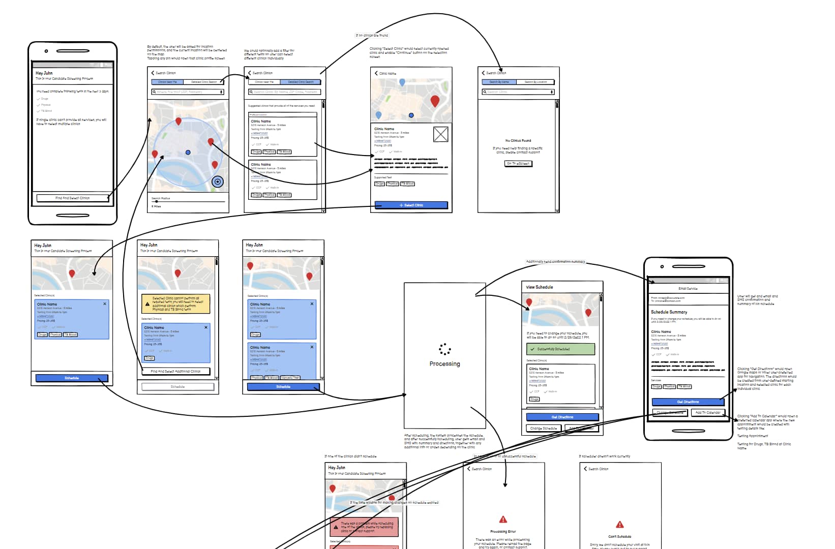
The app features an easy-to-use interface that allows users to quickly search for and select their preferred clinic, view a map of clinics, and schedule their appointment in just a few clicks. Users can also receive appointment reminders and easily reschedule or cancel appointments if necessary. To ensure a seamless user experience, the app is designed with a clean and modern interface that prioritizes user needs and preferences. The app’s design is informed by extensive research into user behavior and preferences, as well as feedback from real users. Overall, the clinic appointment scheduling app is a user-friendly solution that makes scheduling clinic appointments a breeze. I aimed to design the app utilizing the UX processes, Research, Discovery, and Design.
The appointee is a made-up brand that will serve to replace the original client trademark since this project is protected by NDA.
Discovery Phase
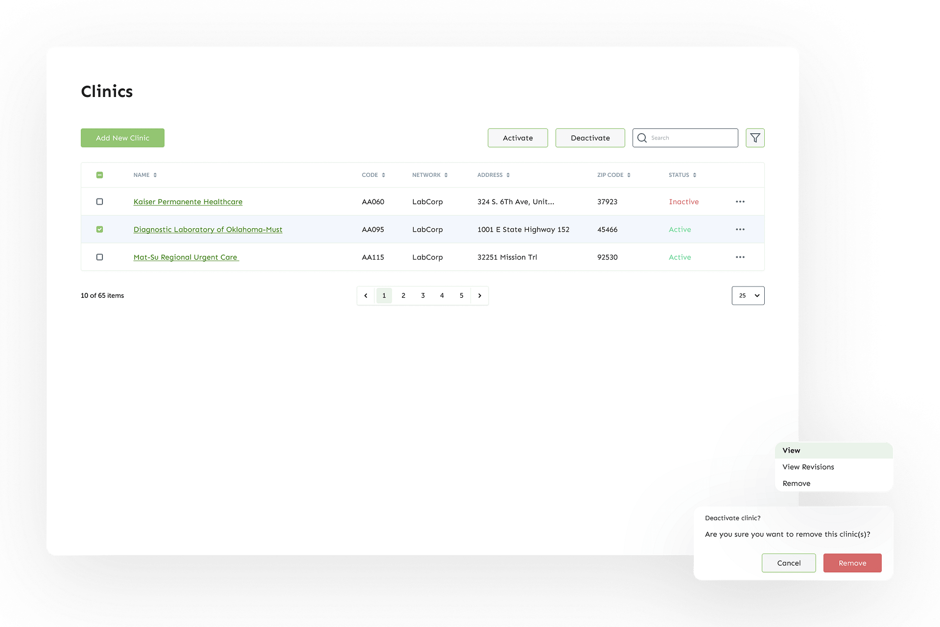
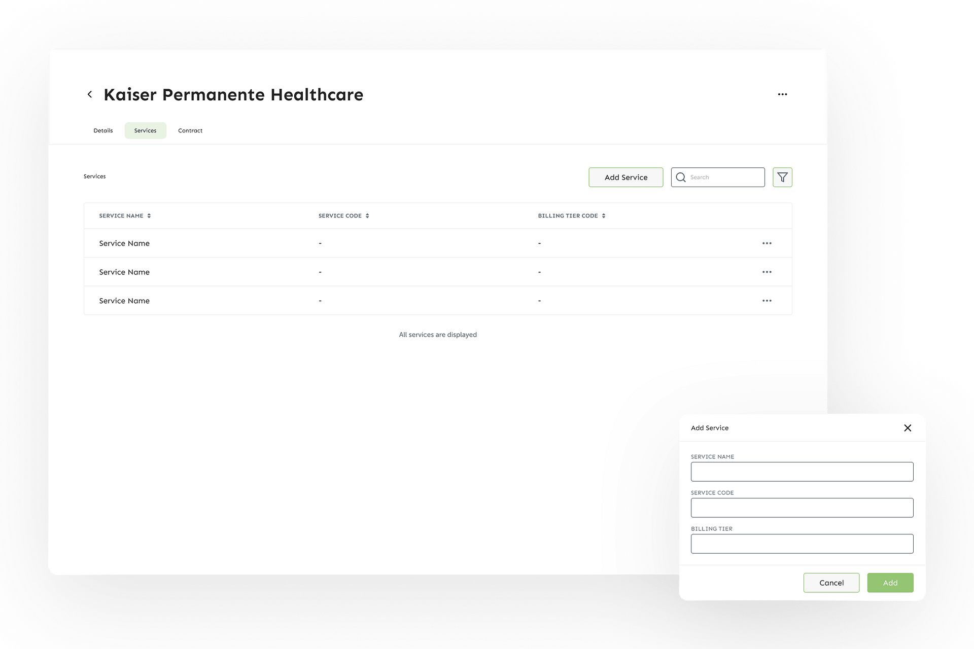
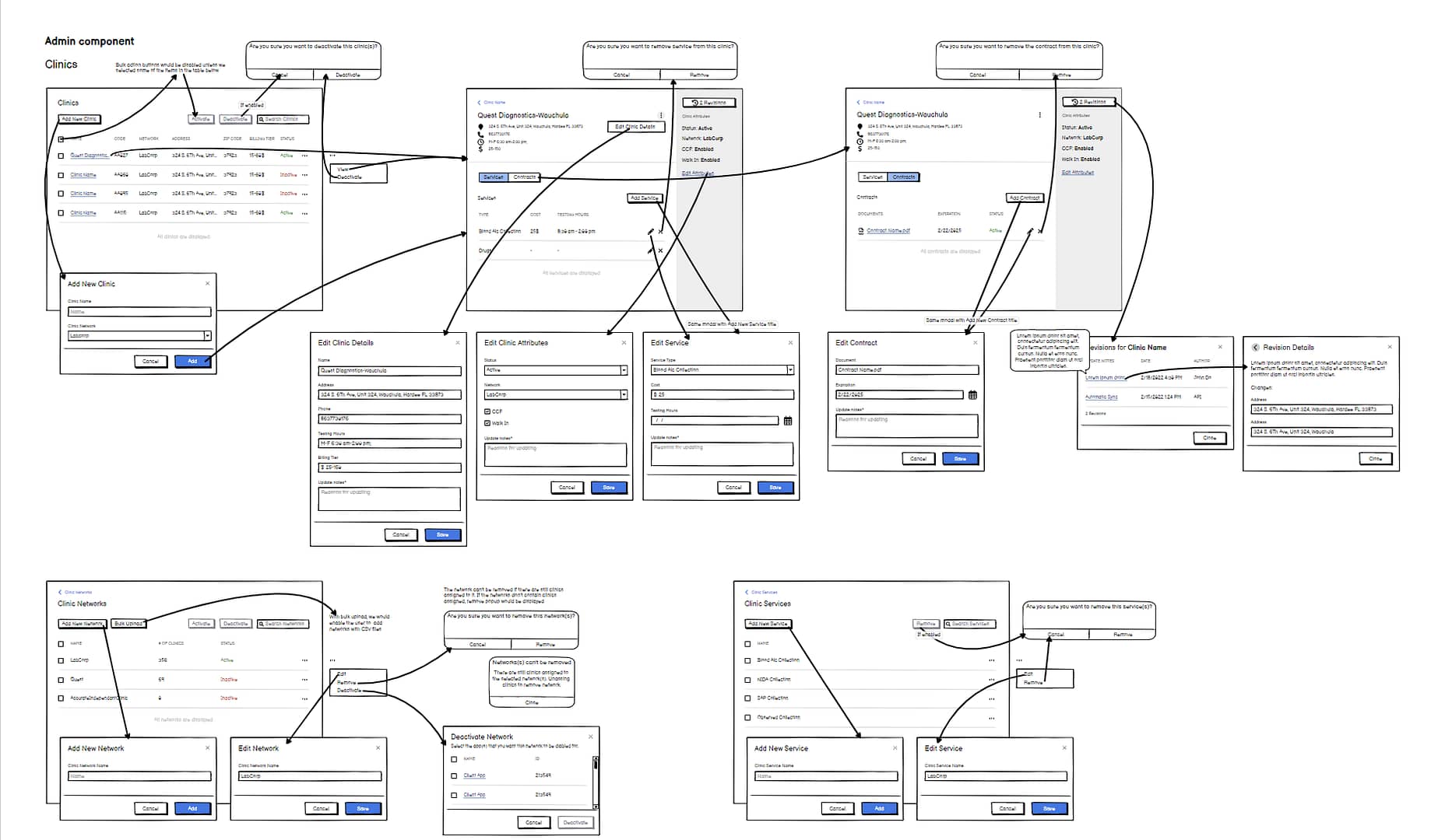
After getting all of the client’s requirements I did thorough research and analysis. I defined the problems that the users currently have with scheduling appointments in person, and how to make that process lightning-fast while still following the clinic’s procedures. The app has two segments, the user area, or the appointment app, and the admin area where the admins will be managing clinics and appointments. It was crucial for a design to make both of those segments as intuitive as possible. These two segments are explored individually but keep a close connection between them since they are dependent on each other. Additionally, by conducting research I concluded that it was paramount to make app accessibility a priority. With everything in place, I started creating wireframes and connecting the problems and solutions.
Design Phase
Since the app would be used by a variety of users with different needs and conditions, the app needed to be as simple and intuitive as possible. By dividing the process into individual steps one by one, and focusing on one task at a time, the users will complete their goals with a breeze. Together with the UI and exploring different features, I was creating a design system that was used in both desktop and mobile user experience. The design system made both segments of the app coherent, and clear and created structured unity for the users. Accessibility was a really important segment that was prioritized in the design system, although there were a lot of compromises following the client’s requests.
