Nutricija
Web app for nutritionists
Visit websiteEating healthy is a must for anyone that wants to live a long and happy life. It could be hard to make time for cooking and planning a healthy diet, so a lot of people need a bit of extra help. That’s where nutritionists jump in and make life easier. Making an analysis of a person’s health, preferences, needs and wants can be really daunting task, even more than organizing the correct diet for the specific needs of a client. My client had an idea where he wanted to create an application that would connect nutritionists and their clients in real time, where they have all of the necessary information on a single platform.
The development of the project was already launched before any of the design processes. Shortly after that, the client figured that process needed to be more sustainable and that they are losing the overview of the project. He needed a more organized approach that would streamline the process and that would make sure the project is going in the right direction. My role was organizing the process, exploring user experience, creating wireframes, designing the user interface, creating a design system, and finally designing and creating a presentation website on the WordPress platform. A bit more detailed process will be described below.
Discovery Phase
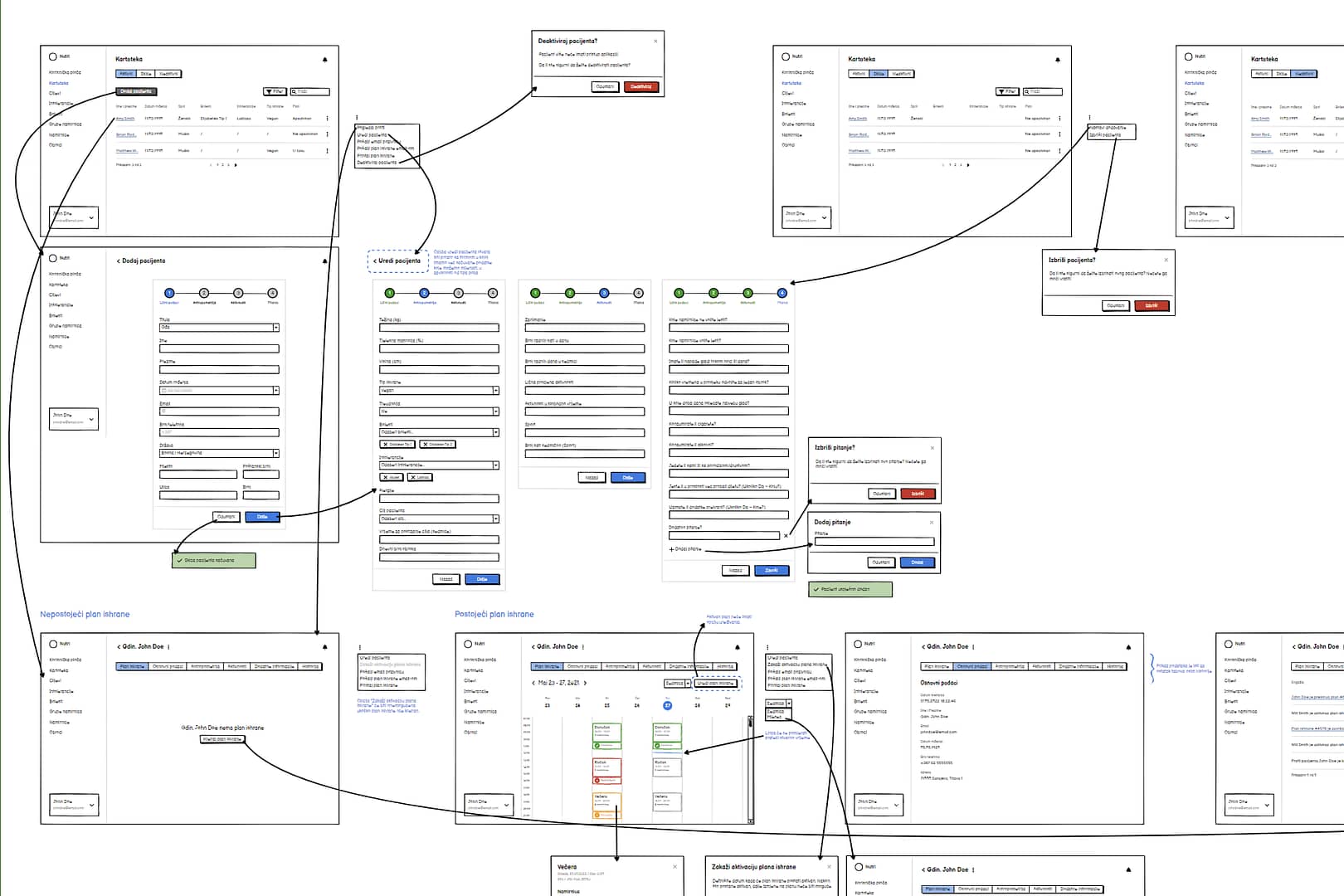
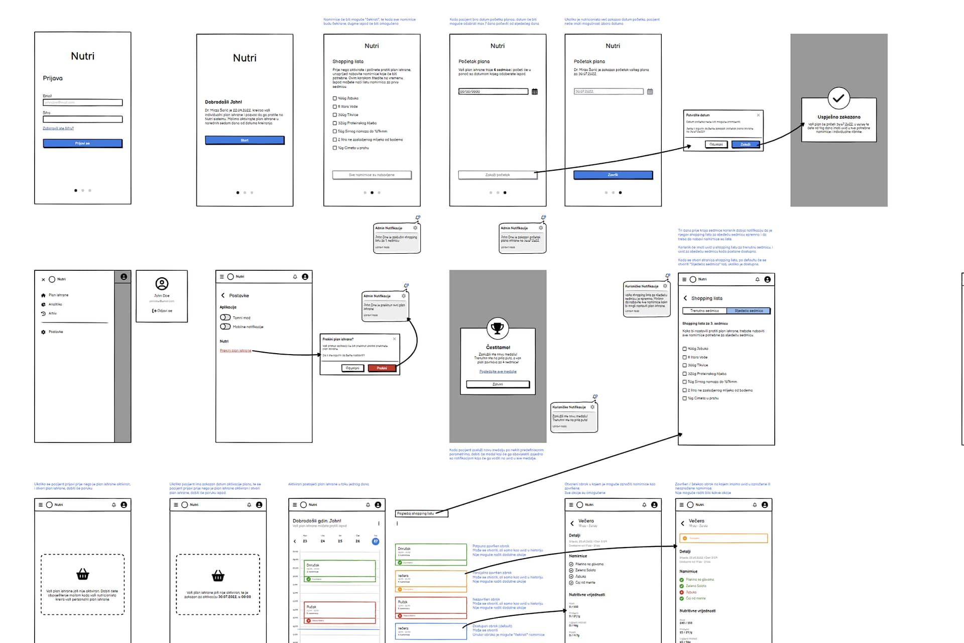
The first steps after getting insights into the project and current progress were defining the problems and creating a scope of the product. Since the app has a lot of different parts that support nutrition plans, it was really important to connect them in a single logical structure where everything is manageable easily. The app consisted of an admin area which is used by nutritionists and a user area which is used by clients. These two segments are explored individually but keep a close connection between them since they are dependent on each other. Nutritionists had a set of problems that the admin area needed to solve, and the users had their own problems that are completely different. After the initial research, I started creating wireframes and making flows and user personas. Meeting expectations and solving problems for both parties was the crucial part of this step of the process.
Design Phase
After creating and grooming the wireframes, I started working on the UI for the admin part, and later on for the user part of the application. UI needed to be simple, yet effective and organized. All of the segments of nutritionist planning needed to be dynamic and easy to manage. While creating a modern UI, I was simultaneously creating a design system that was used throughout the app. The hardest part of the app was designing a nutrition plan creator which consisted of the calendar and the meal-defining component. There were a lot of requirements and limitations to those components, but I found inspiration in the Google Calendar which is a really simple and powerful tool. Adapting the methodology of Google Calendar and the goals of the Nutri app, I was able to create an intuitive tool for defining meals that work seamlessly with other parts of the app. Additionally, the client wanted to have UI in light and dark modes which was also a daunting task.
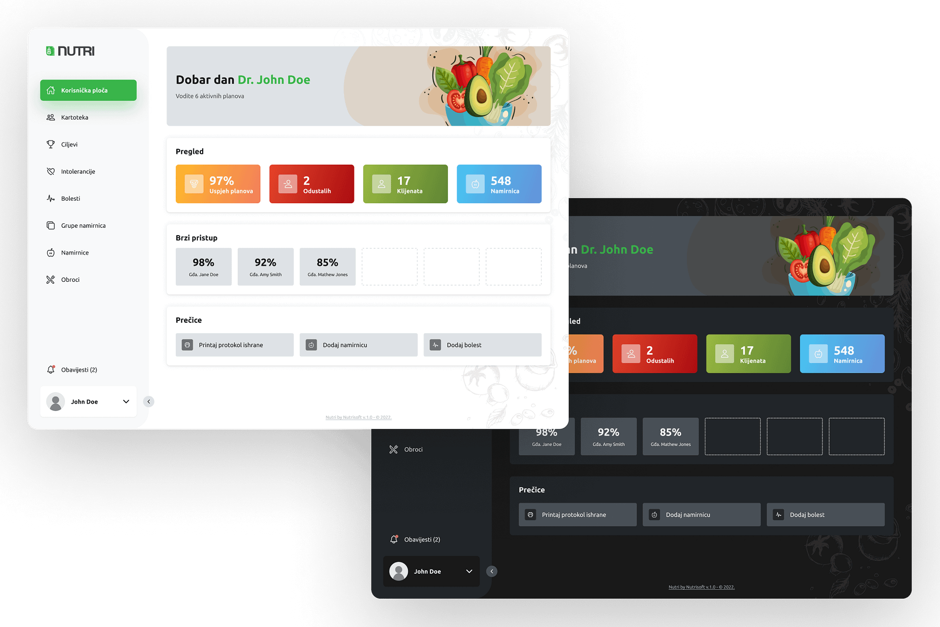
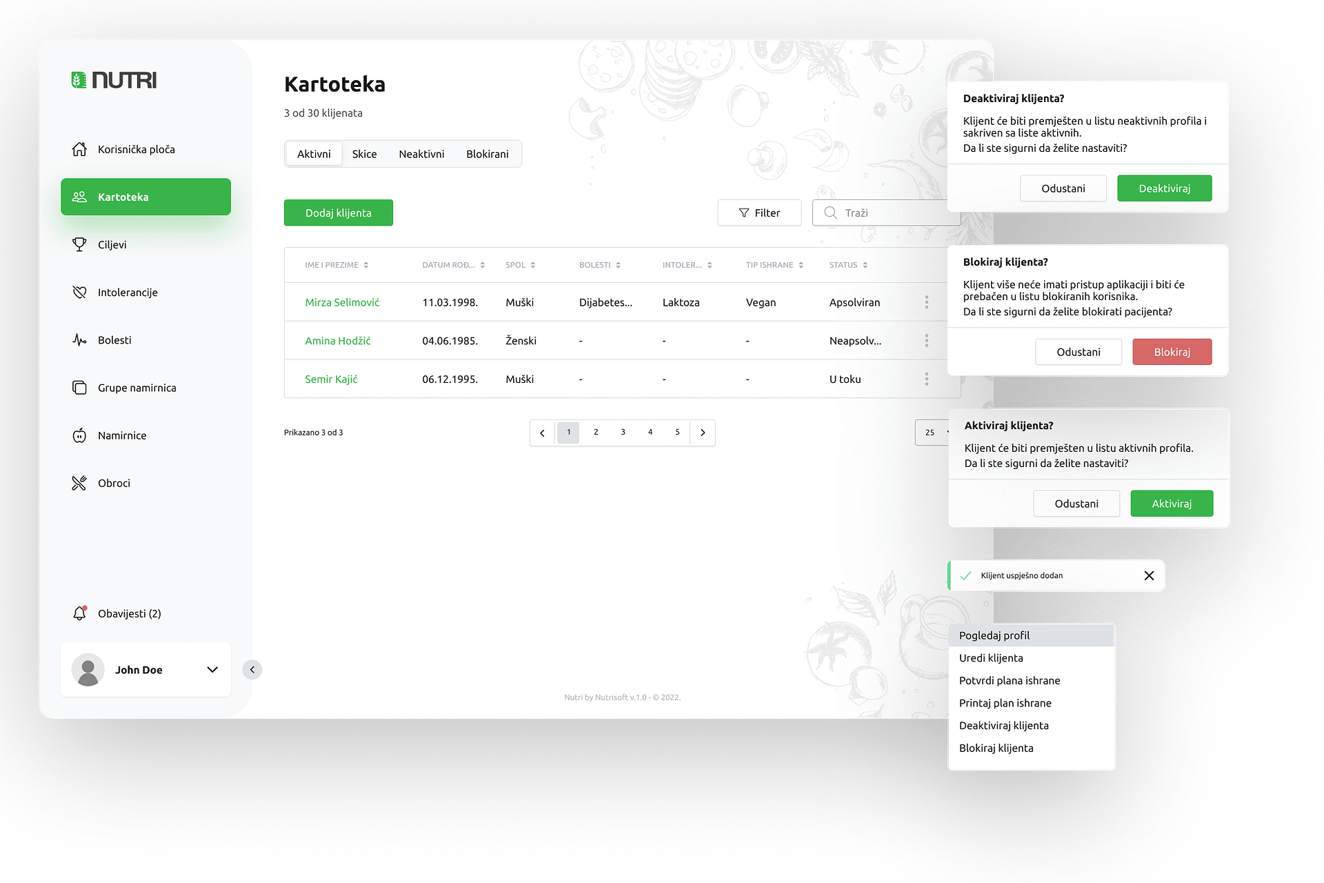
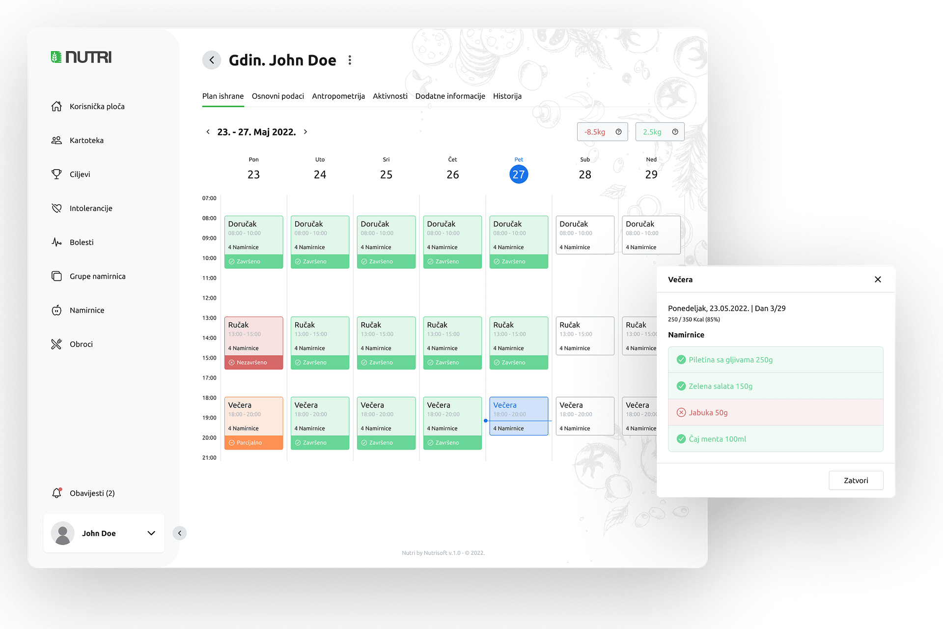
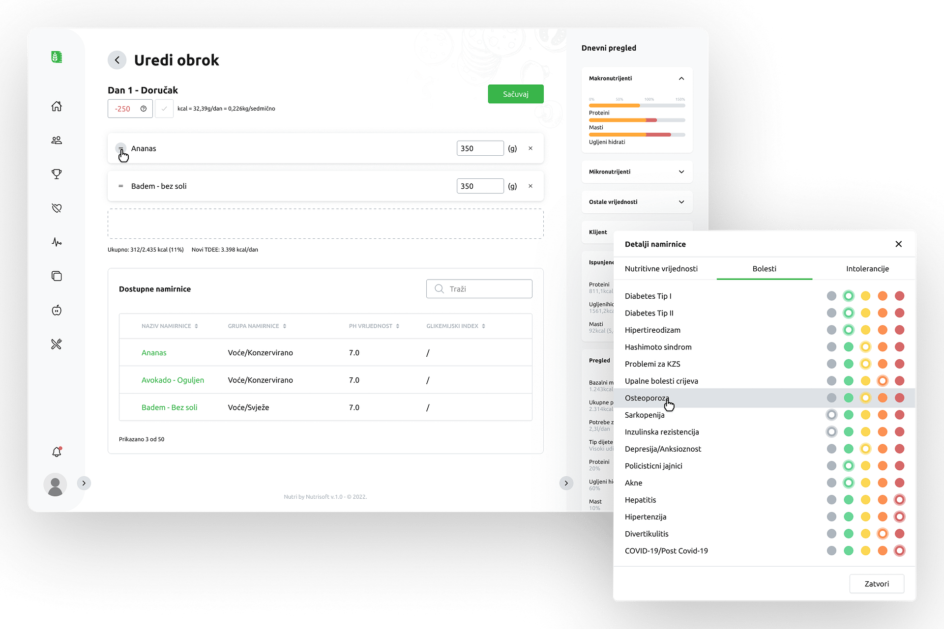
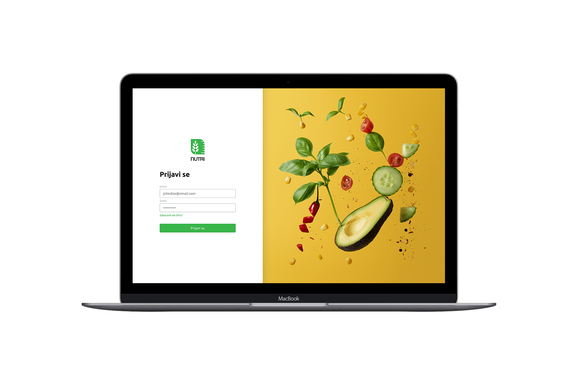
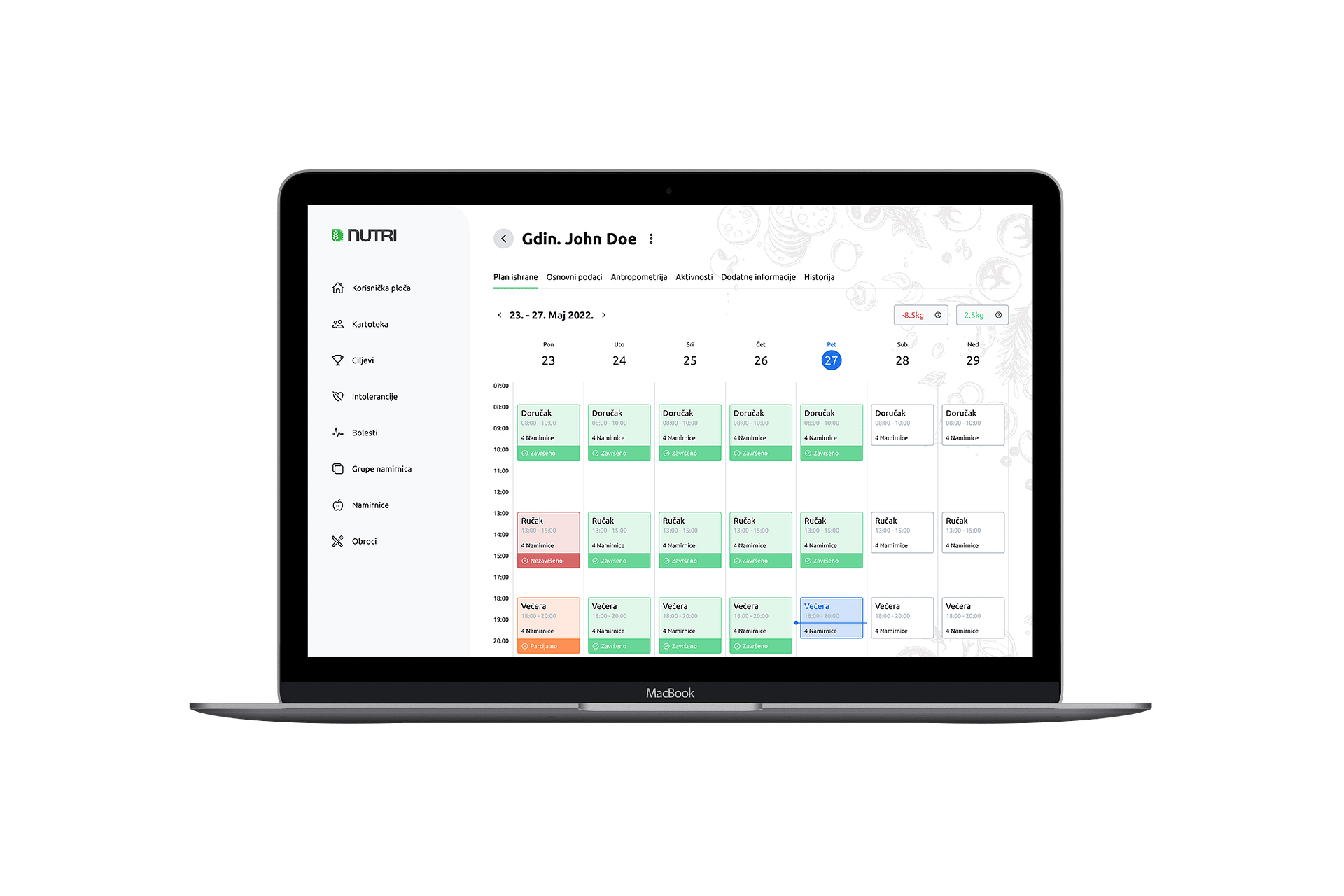
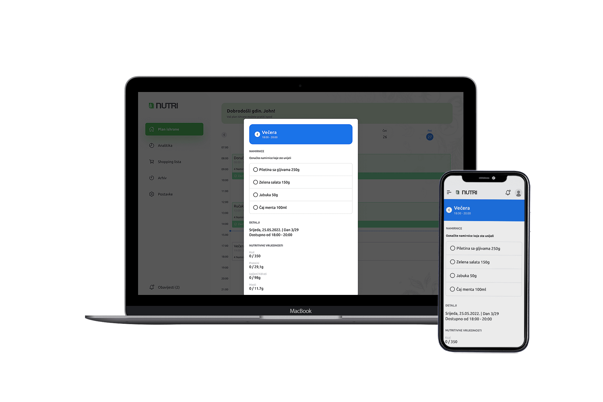
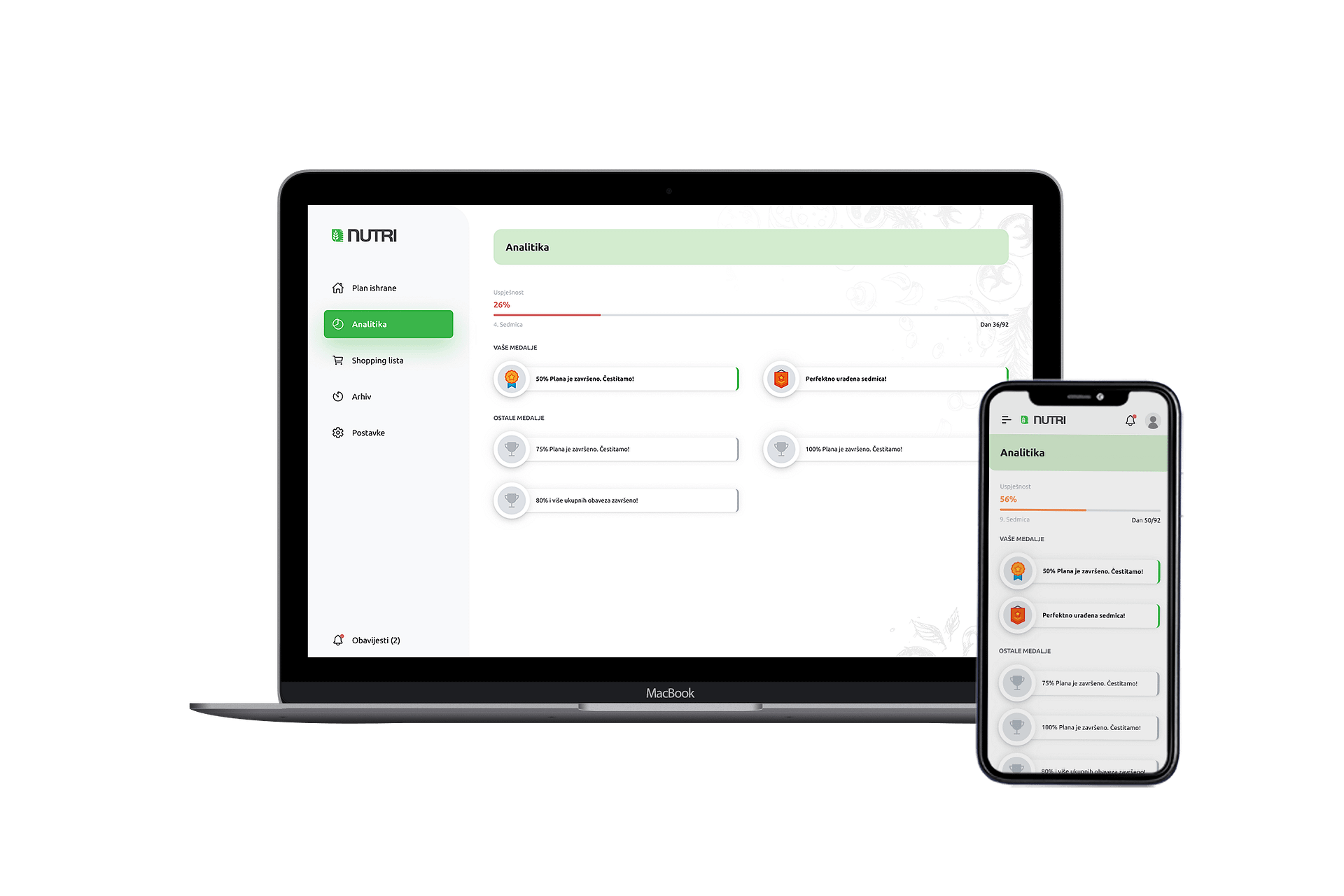
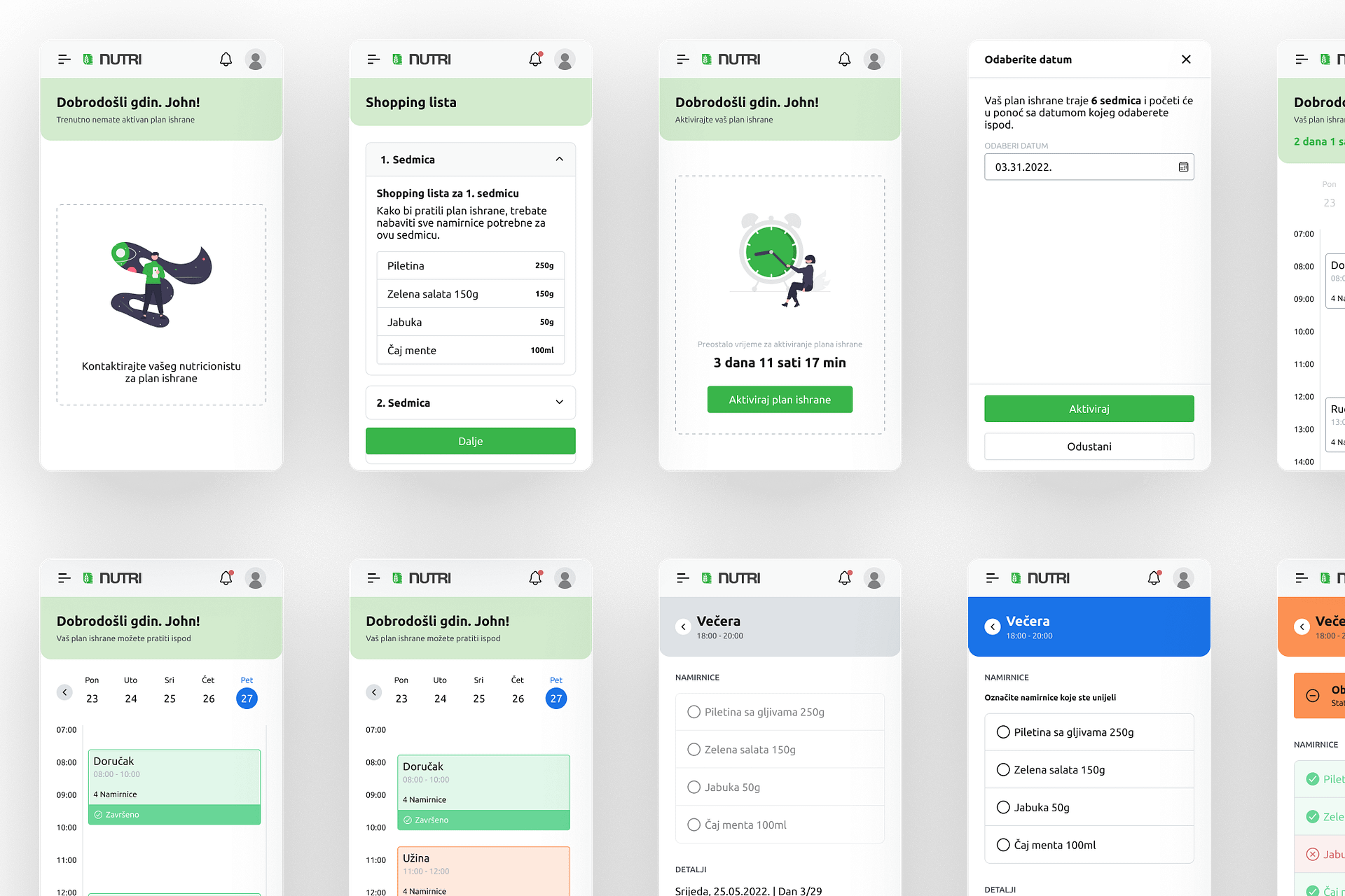
The same style and components from the Nutri design system were used in the mobile app for the clients. This creates a sense of unity for the whole brand and makes it possible to expand the app in any direction needed. The mobile app is the most prominent part of the infrastructure, and it was paramount to be simple and intuitive for the users since they need to use it every day. Users need to open the app each day, select a meal that is currently in focus, and check everything that they completed. This saves the progress of the plan, and the nutritionist can track progress in real-time.
Website Design and Creation
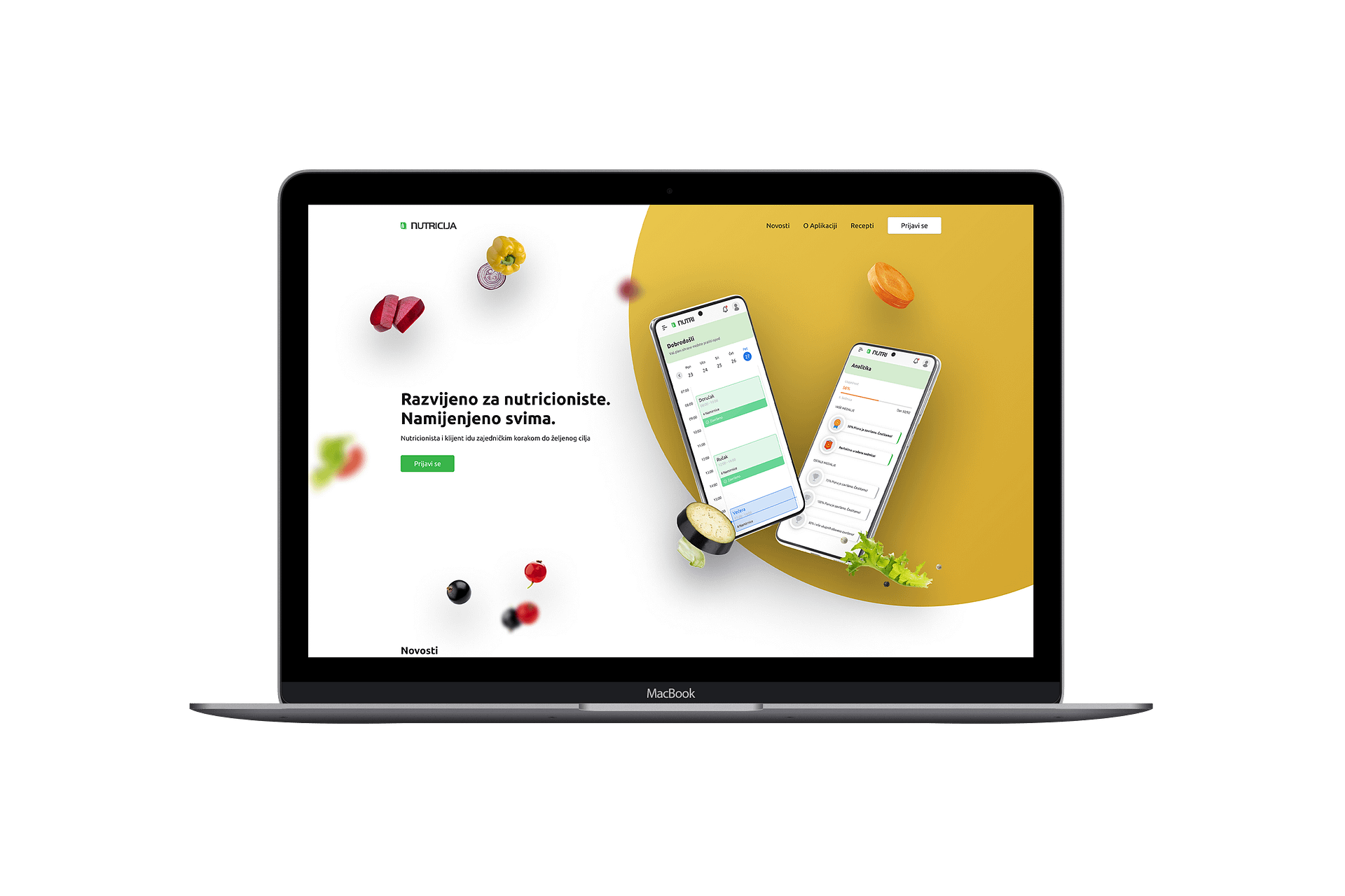
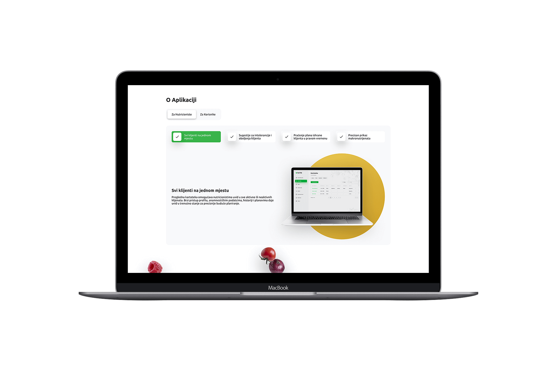
The last part of the project was designing a website that would present the app and all of its strengths to nutritionists and potential clients. The website needed to be modern and attractive while making all of the information accessible to everyone. It would also serve as a landing page from which the clients and nutritionists could log in to the app in the near future. After designing the website, I developed it on the WordPress platform which enabled the admin to change any part of the website or add something new related to the app itself. Additionally, the client wanted to have a blog system and a system where he could write and share recipes for meals.
