UX Process Breakdown
How a product comes to life
Blog post originally written in 2022 for Mistral Technologies
Through our lives we are always part of the UX process as end users. We use a lot of apps daily and they help making our lives easier and richer. Even though we don’t think a lot about those apps and how we got used to them, but each of them had a huge process behind, with a lot of people involved. Each of those apps could be project on its own, and have its own story, its own goals, problems, solutions, its target groups. There are many different aspects in the process of creating them that we need to take into consideration like project purpose, form & function, project teams, technologies, etc.
As we could assume, it’s almost impossible to have a fixed process that always goes in the same flow, the same timeline, and to solve problems in the same way. That’s why we tend to use different methodologies and principles in our approach to projects to be able to easily adapt to any kind of project and obstacles. The same things also directly affect the UX process in the projects, like project timeline, budget, client, existing assets, etc. There are projects where the client only has the idea of what he wants to get, and projects where the client has the whole architecture predefined, or design system already created that we need to use, and many more things. As we can see the UX process is relative to the given situation, but since it is one of the most important parts of the whole project, it’s crucial to get the foundations right. To make the development process possible, and easier, we are creating solutions for a lot of problems in the first steps of the UX process. Each step of the UX process could be the topic for itself since there could be a lot of things that go into each one of them, but I will try to cover the fundamental concepts and the results we get. To have the UX process more tangible, it could be broken down into a couple of fundamental steps:
- Project intake
- Discovery
- Research
- Wireframes
- Look and feel
- Delivery
- Design phase
- Wireframe changes
- High fidelity mockups
- Prototyping/Animations
- Delivery
- Usability testing
Lift Off
After successfully enrolling potential new clients, the sales team introduces them to our EE (Engagement Enablement) team. EE team is a dedicated group of experts who have a goal of supporting teams throughout the entire project lifecycle which gives us a competitive advantage as a business professionals. It consists of some of our most experienced project managers and project owners, solutions architects, and UX designers. As the first point of contact, the EE team is introduced to the client and they are taking responsibility for the very first steps of the project. They will also be the main point of contact for the client through a couple of stages: Project intake, project discovery, project initiation, and later on they will pass the project to the delivery team through different onboarding sessions.
With the first pitch presentation, the team introduces the client to the company, the processes they are going to follow, people, technologies, and basically try to get to know each other.
Project intake
The team exchanges important documentation with the client and the UX designer reviews all the documents that the client has delivered, from which he can start the discovery phase. The project structure is then created, the files are organized into different groups, and all other details are agreed upon on couple of meetings with client. They define meeting frequency, timeslots, points of contact, etc. The result of the project intake phase is good organization of materials, communication, and teams.
Discovery phase
The Discovery phase is the most important part of the whole UX process. It is the preliminary phase that involves researching the problems, framing them to be solved, and gathering enough information to determine the initial direction. One of the reasons the discovery phase is the most important step is that it sets the project in the right direction by focusing on the right problems while iteratively creating the right solutions.
Research
The goal of the research is to get meaningful information from multiple sources, like documentation the client delivered, the client itself, the market, users, and many more things that we can explore. Since everything is dynamic, this phase can be split into multiple different steps.
Goals and values – A deeper understanding of the values that the product will bring to the end-users and for the client. Creating a value proposition on how the product will precisely solve problems.
User needs statements – These are problem statements that are defined from the user’s perspective. It helps us to get in the perspective of the users and better define problems that we need to solve.
User journey maps – By creating a visual representation of the precise steps that would end user do to get some goals completed, we are helping the team to better understand customer needs and wants.
User personas – They are fictional, yet realistic descriptions of the regular users of the product. They are described by referring to real person needs and wants. While being based on user research, they support user-centric design.
Flowcharts – They are used to describe different flows, processes and structures. Used mostly for structuring different pages and steps like registrations, logins, payments, etc.
There are many more steps that we can utilize, and you can use or skip any of them in the discovery process. They all bring a lot of value but depending on the project itself, you use what is necessary to better understand the core problems.
The type of discovery that we use is an intensive 2-week process where the team and client, who may or may not have a good understanding of the software, constantly have meetings, and together we are basically ‘discovering’ the product. In those two weeks, everything from the previous steps is summed up and analyzed. We are reviewing basic requirements, helping and consulting clients on making decisions. We are getting fully involved by showing the client that we really understand their product.
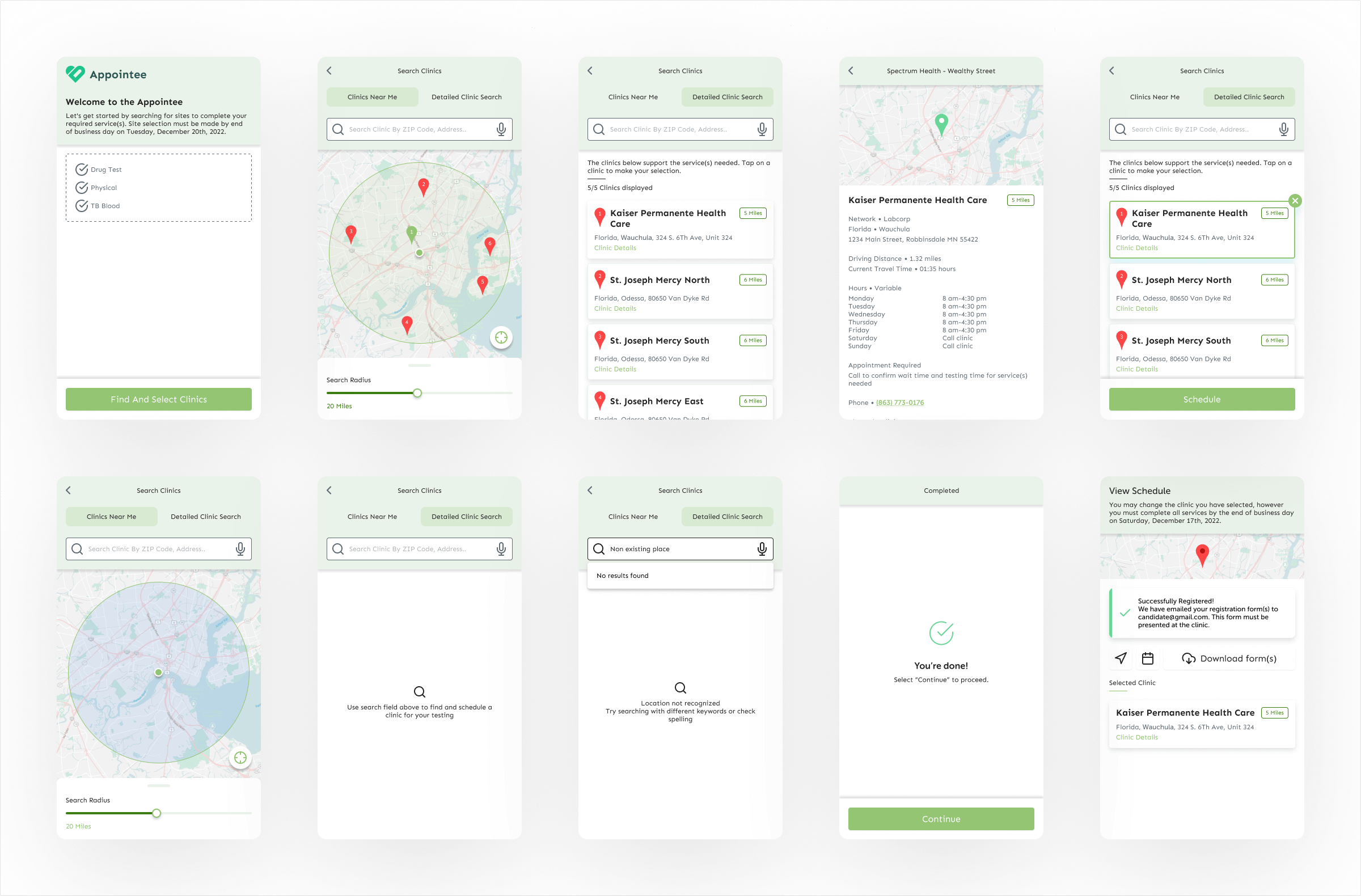
Wireframes
The first week of the discovery is very intensive. After the initial meeting on the first day, the UX designer starts creating the first wireframes which follow previously defined goals, and they are focused on solving defined problems. Wireframes usually tend to be sketch-like drawings that describe different user flows and every possible interaction with the product. Of course, it’s not crucial for them to be highly detailed, but we think it’s very important since it leaves a small margin for possible misinterpretations by the client, or by the developers when they start working. Detailed descriptions also help project managers to create development tickets more easily.
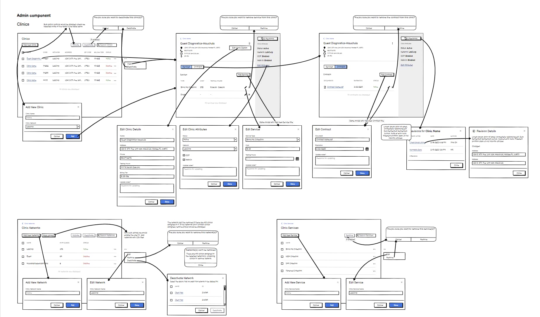
Wireframes in this first version won’t necessarily be the most accurate or most appealing, but they are going to help create a clear vision of the product by using predefined structures and flows. The first version will be presented to the client at a meeting two days later and will be reviewed together with the team. On that meeting UX designer will gain useful feedback from the client, like, is the product going on the right path, are the requirements met, and much more useful information that will help him in the process of completing the wireframes. After the first review, the team meets with the client every day for the rest of the two weeks, and they review the progress of wireframes repeatedly. As we can see it’s an iterative process that helps us to get closer to the final product.
There are a lot of tools for creating wireframes and the decision on which to use is not crucial. Designers can use pen and paper, or more advanced software tools like Figma, Balsamiq, Whimsical, etc. but the goal is the same, creating the initial structure of the product. Our personal preference for wireframing tool is Balsamiq since it’s really intuitive, has a lot of predefined elements and most importantly it creates an intimate connection with the spectators since the screens look like they are hand-drawn.
While presenting wireframes to the client, he usually gets a lot of ideas, or maybe remembers some things that they previously overlooked or forgot. These things could easily affect the whole project and significantly increase the effort of the team. This is called the scope creep, and it’s one of the main reasons why teams need to define the MPV (Minimum viable product) which is the predefined scope that has enough features to make the project feasible. All of the features that are not included or proposed in the MVP are going to be planned in future iterations and scopes.
In the wireframes, the UX designer starts with creating the first couple of screens, like onboarding screens, registration or login, as needed depending on the requirements. As you can assume, with the big enterprise systems, these wireframes can get really complex. To avoid getting them messy and unmanageable, we group screens into different flows, sections, and structures.
Starting with one of the most important elements of wireframes, the navigation, we usually try to follow best practices in the process. That makes the product a lot more intuitive since the user can notice the patterns that he is already used to, and he immediately feels more connection with the product. Navigation guides the user to where he wants to be, and we can help them by using the standard things like pages and subpages, standard ordering of the navigational items, easily accessible home and back buttons, telling them where they are on the page, etc. Following predefined structure, we go deeper by creating screen by screen, while connecting and describing the interactions between screens. As the screens unfold, things get a lot more complicated, and we need a lot more components to support the flows, like modals, wizards, alerts, forms, and many more.
Starting the second week of the discovery phase, we are in a much better position with requirements, and we have a big chunk of the product visualized and discovered. The client now understands the process and is comfortable with the product heading in the right direction. Documents like the architecture blueprints are written by experts so that the client can set their expectations properly on development.
Look and feel
After creating wireframes, we can now start thinking about the visuals and the user interface. There are a lot of things that go into product UI and it’s important that the base is done correctly so it is easier to manipulate later on. Based on our wireframes, the designer creates a couple of screens for the proposal to create a general feeling of what the product might look like.
The final style of the product may be highly dependent on the client’s brand guidelines if they exist. We can have a situation where we must use predefined design systems, or we could use only visual preferences of the brand, like colors, typography, components, or to create a whole new design system from scratch. Except for client preferences we could also use third-party design systems like Google’s Material design, Apple Human Interface, Microsoft Fluent, and many more that could be suitable for a given product based on some parameters.
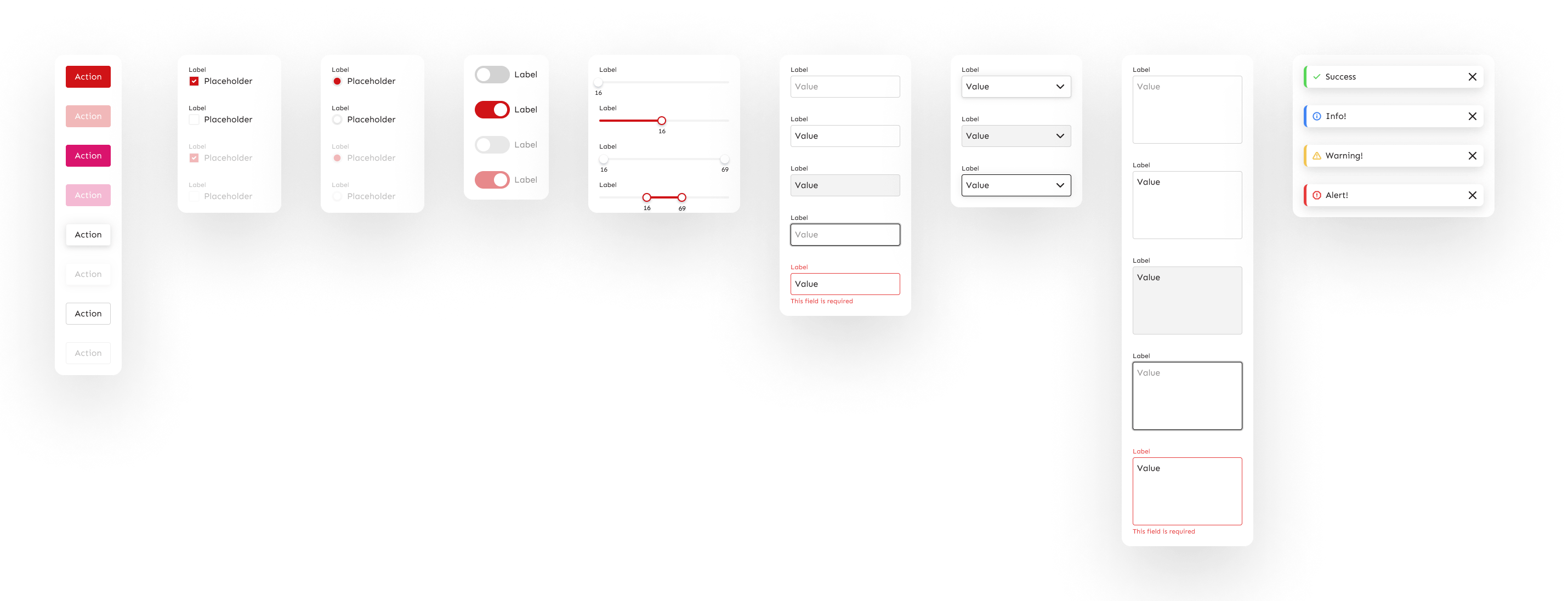
If we are creating the product from scratch and don’t have a design system, creating high-fidelity mockups would usually start with laying out elements and creating the structure of components based on the wireframes. It’s important to define the grid system that would help us organize the hierarchy and to have elements in visual balance. The colors of a product brand would be usually used as a primary color on which we would accent the product. Based on the primary color, we would create a color palette where a couple of tints would be defined, like primary, secondary, and tertiary, black and white, from dark gray to light gray, alert, warning, success color, and many more. That would be the basis on which we could add colors additionally as needed. By creating screens and elements from scratch one by one, we are also creating a design system from which we can reuse the elements. Having a design system is important for having consistency through the product, even if we have multiple different services, by using the same or similar elements, we are creating the impression of one big brand. In some tools, we can create a design system library with all elements defined as reusable components that could be linked through many screens or even other projects. By doing so, we can update hundreds of instances of the same component in a single place. E.g. We could change the color of the input field in one place, and it would be automatically updated wherever we have an input component.
Speaking of tools, a really important decision that the team needs to make at the beginning of the UI phase is what tools they are going to use for creating the mockups. Different tools will make life easier or harder later in the project, and it’s really hard or impossible to change tools in the middle of the project. If the client doesn’t have requirements for a specific tool, the designer has a lot of options, and each one has its pros and cons. Before deciding, it’s important to understand the needs of the team and product by defining specific questions, for example:
- Will multiple designers work on the project or just one?
- How are we going to present mockups to the client?
- Do we need interactive prototypes?
- How are we going to deliver the mockups to developers?
By answering the specific questions, you can filter through the tools for the one that suits the needs of a team and a product. The most popular tools for UI currently are Figma, Adobe XD, Sketch, InVision, and many more. The important thing to note is that these tools are just that, tools, and they are not going to do the work for you. The designer needs to be more comfortable by knowing what he is creating, rather than in which software he is creating.
With high-fidelity mockups ready to go, we created a representative group of assets that show our understanding of the product, mockups show design skills, and other additional documents help us to form a deal.
Delivery
We came a long way in this two-week process. Before giving the final proposal to the client, the designer and the project manager are working closely together to make a clear list of requirements based on the wireframes. With these requirements defined and organized in a spreadsheet, the team meets and estimates the hours needed to complete a particular feature.
With all pieces ready to go, the client is confident that the team is up to the task, and after reviewing the estimate and price, he is ready to make a final decision. The whole Discovery phase could finish here if the client doesn’t want to proceed with the project, but that’s not usually the case. After investing this much time and effort into creating the product proposal, it’s in the best interest of the client and the team to proceed with the project.
Design phase
After the final review and the client’s decision, we start the development of the product using the agile methodology. Agile is a way of managing project by breaking it into several phases and using constant collaboration between the stakeholders and the team. It basically cycles between planning, executing and evaluating. We break projects into two-week sprints and by previously aligned plan, everyone gets to work.
Wireframe changes
If there are some changes in the meantime, the designer tweaks the wireframes, and depending on the impact of the changes, tickets should also be updated. Usually, we could do only small tweaks, but changes with bigger impact are usually communicated with clients, and they are pushed to the next iterations outside of MVP so they won’t affect predefined estimations.
High fidelity mockups
While the team organizes and sets up everything for development, the designer starts working from the beginning following wireframes screen by screen, and he usually has one or two-week head start so developers would have UI ready when they start working. Depending on the tools used, the designer provides the team possibility to preview and inspect design on the individual component level.
This process continues, we design and build everything in cycles. The client and the team would review the progress on weekly or daily grooming sessions, and we would iterate and improve. There are cases when the design needs to be refactored if there are development obstacles, like technology limitations or improved UX. If the budget and timeline allow, it would be recreated or refactored in order to solve and mitigate the problem.
Prototyping/Animations
After we complete certain flows and have the screens ready, it is a good idea to create interactive design prototypes although not always necessary. These prototypes would ultimately represent the final product on which we could interact with certain elements and present specific functionalities before the development so we have a better picture. Prototypes are usually created if it’s hard to represent the whole flow or functionality with only static designs.
For the same reason, there is also a practice of creating animations to represent visual feedback of interactive elements, or some presentational features. Animations are rarely done in projects because they require a lot of time and effort to create, but depending on the project and the client, they can be required or defined before development.
Delivery
Delivery in the design phase means both delivery towards the client, and the delivery for the developers. The client should be able to preview design mockups continuously through specific environment, or through individual tickets, but having a bigger picture is always better. Examples could be open space variants where we have all screens organized on one plain environment, or we could just use visual files, documents, prototypes, etc.
To make life easier for our team developers, there are a lot of tools that are offering features of inspecting the design and individual elements. Inspecting means that a developer can click on individual elements and get all kinds of different information about that element. For example, clicking textual elements would enable developers to copy text immediately which eliminates the need of having that text elsewhere. By clicking images or icons we would enable them to export assets or clicking overall components would enable them to get generated CSS codes or different attributes.
Having these environments helps both designers and developers to work independently without the help of designers for exports and styles. Some of the noteworthy tools that have inspect features built in are Figma, Sketch, XD. Other tools that don’t have those functionalities built-in can be bridged with awesome app called Zeplin. It easily integrates with many different tools, breaks the screens into different modules, and enables inspection of individual elements.
Usability testing
Although we could think that our design is awesome or we think it’s awful, those are just our feelings that may or may not be supported by facts. The real value and results come from the field where we could check if the product we created is really useful, and does it solve the problems that it should. We can get a lot of data by utilizing usability testing of the product.
Usability testing is having a specific number of people use the product you created to complete a predefined set of tasks. It could be implemented only with UI and prototypes, which is often the case since we are trying to conclude if the design is working, or we can test after the product is completed with the tools such as HotJar or similar. Testers actions and behavior would be monitored, they would share their thoughts with the facilitator who would communicate with them while giving instructions. The testers would be prompted if there were any confusion, obstacles, or problems they had while completing the tasks. After successfully conducting the usability test, the designer would define all the pain points, obstacles, or any other notes that would be meaningful to the products improvement. With caveats defined, the team could then plan on handling and solving the problems users had.
As we can see, creating a product is a complex process, but with a great team, thorough research, and good planning, it’s possible to create huge systems that are intuitive and user-friendly. With the right approach, we can create solutions that are really helping people and that are solving problems for people. Iterate and improve!
If you have any comments, questions, or opinions, feel free to send an email to: hello@dupovacemir.com or contact us through the contact page. We are always up for feedback!
Cheers 🙂